Slomin’s Website overhaul
Slomin’s indicated they wanted to be able to convert sales online for their home security systems. Their current website was outdated and weren’t able to receive information from customers. Customers were having issues contacting Slomins or finding information via website. I planned to fix that!


business needs
Make the customer experience as simple as possible. Slomins needed to receive customer information to convert alarm requests into sales.
The business wants to gather customer information to increase the value of their sales and provide a seamless online experience for the customer.
Design challenge & hypothesis
The challenge was to gather customer information and provide a seamless customer experience.
I believe by condensing, simplifying, and therefore redesigning the site, I will give a better way for customers to purchase Slomin’s products and to allow Slomin’s to gather important customer information for future selling.
homepage
K.I.S.S…. Keep It Simple, Stupid! That was my goal when it came time to redesign the Slomin’s site. After much research and testing, I found that most of Slomin’s business happened while speaking directly to the consumer. Many consumers weren’t sure of their needs and speaking with a trained rep helped them get what they needed in regards to home security. Even our competitors like ADT follow a similar model. While you can get an alarm system completely online, there are many CTAs requesting either a call or a rep visit.
With that in mind, we wanted to make this experience as simple as possible. So placing the most important CTAs up top, followed by what you get with the basic alarm package, which is then followed by services, history, and testimonials. We have various CTAs throughout to make the customer journey as easy to navigate as possible.
eligibility
Once a customer clicks on one of the CTAs to proceed, they are taken here where we gather important information about the customer. This is arguably the most important information to Slomins since they need this information in order to reach out and sell to a potential customer. We wanted to make this part as painless as possible, so we we just require two of only three fields of information from the customer
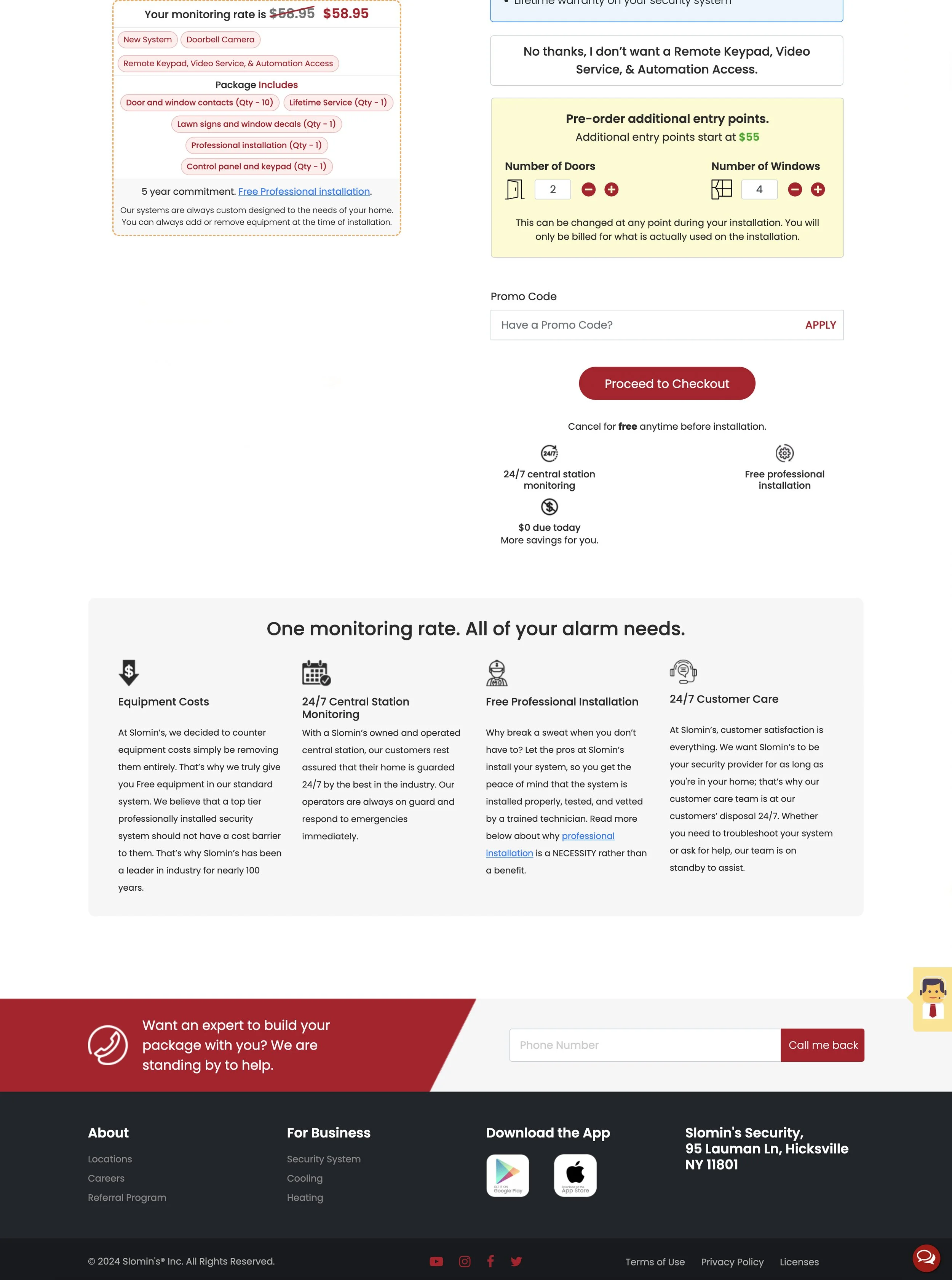
offer selection
Once a customer has checked to see if our service is available in their area, they proceed to the offers page, where they get the basic system, any add-ons of their choosing, along with any free offers Slomins may have for their customer. As they make a selection, more options open up further down the page. From there, the customer will proceed to the checkout.
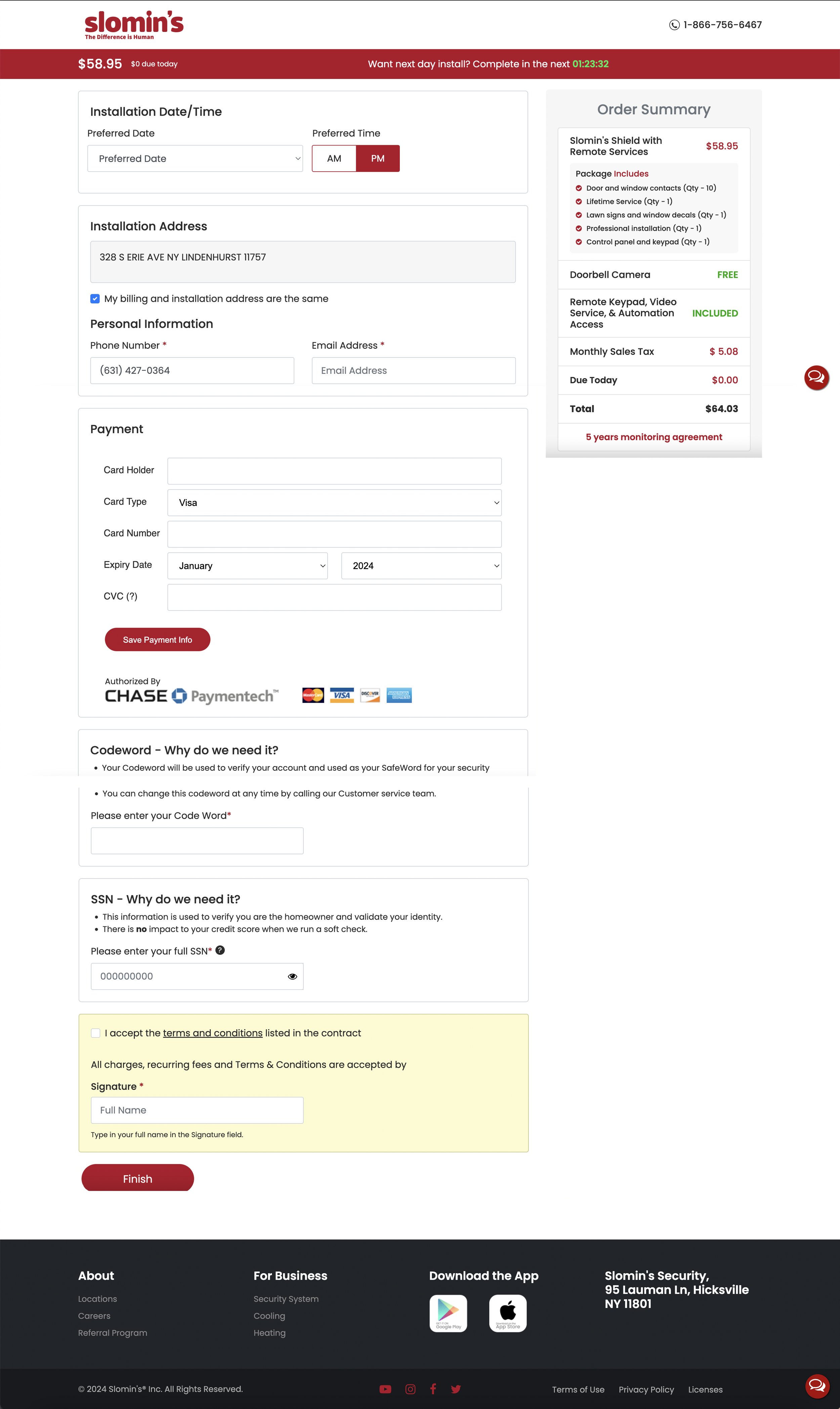
check out
The final step! This part is also pretty straight forward. Customer gets to choose a day and time for installation of their alarm system. Slomins gathers all necessary info for payment, with a brief order summary on the screen. Once all fields are completed, and the customer selects FINISH, they receive a confirmation of their order and date of install.
solution
Study the customer! What I found through initial designs was that offering a full blown ecommerce site wasn’t providing the results we were looking for. Slomin’s provides a basic alarm package for free if you use their monitoring service. That is what the majority of their new customers were looking for.
So I streamlined the process. Most info about the products and the company will be on the main page, easily accessible via navigation. Two simple CTAs were placed to view monitoring rates and to view offers. From there it’s just a couple steps where Slomin’s gathers customer information, customers can choose their plan and add any additional accessories to the alarm package, and purchase and have it installed the next day by a trained technician. Along the way there is a live chat ready to answer any questions (a feature previously unavailable on Slomin’s site), and an option to even have a trained professional call and walk through exactly what a customer needs. The redesign led to a substantial increase in revenue of approximately $9.5 million in year one alone.